Quick answer: To make an animated logo, start by deciding where it’ll actually be used (website header, social profile, app splash screen), pick an animation style that matches that context, keep the motion simple enough to not feel distracting, and export it in the right format for where it’s going, GIF for social platforms, a code snippet for a live website.
A logo that moves catches attention in a way a static one can’t. But animated logos also go wrong in predictable ways, too flashy for the context, too slow to load, or exported in a format that doesn’t actually work where it’s needed. Here’s a practical process for getting it right.
Why Animate a Logo at All
A static logo works everywhere, print, business cards, plain image use. But a lot of places your brand shows up today are inherently digital and dynamic: website headers, app loading screens, social media profiles, video intros. In those contexts, a subtle bit of motion signals that a brand is current and cared for, in a way a still image simply can’t communicate.
That said, animation should support your brand, not distract from it. The goal isn’t “as much movement as possible,” it’s movement that fits the context and doesn’t wear out its welcome after the third time someone sees it.
Step 1: Decide Where It Will Actually Live
This single decision shapes almost everything else. A logo animation meant to loop quietly in a website header needs to be subtle and non-distracting, since visitors will see it repeatedly while reading your content. A logo animation meant for a one-time intro on a video or app splash screen can be bolder and more dramatic, since it plays once and moves on.
| Use Case | Animation Intensity | Loop Behavior |
|---|---|---|
| Website header | Subtle, low-key | Continuous, unobtrusive loop |
| App splash screen | Moderate to bold | Plays once, then transitions away |
| Social media profile/intro | Bold, attention-grabbing | Short loop or one-time play |
| Email signature | Very subtle or static fallback | Continuous if supported |
Step 2: Choose an Animation Style That Fits Your Brand Tone
Animation styles generally fall into a few families, and each communicates something different:
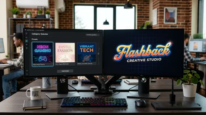
- Simple 2D motion (pulse, float, fade): Clean and professional, works well for most business contexts without drawing too much attention.
- 3D-style transforms (rotate, tilt, flip): Feels more modern and tech-forward, good for startups and digital products.
- Particle or liquid effects: Softer, more organic movement, fits wellness, creative, or lifestyle brands.
- Artistic effects (typing, glitch, neon flicker): Bold and attention-grabbing, works for gaming, entertainment, or brands wanting a strong personality statement.
Matching the animation family to your brand’s overall tone matters more than picking whatever looks the “coolest” in isolation.
Step 3: Generate and Compare Multiple Options
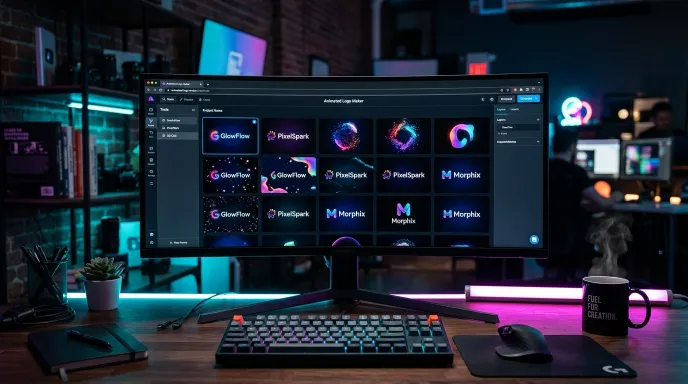
Trying to hand-design a logo animation from scratch, especially without animation experience, is slow and often frustrating. A faster approach is generating a batch of options across different styles and animation types, then comparing them side by side.
A dedicated animated logo maker lets you do exactly this, enter your name, pick a category and animation type, and generate a batch of results you can compare instead of committing to a single hand-built attempt. Since results are adjustable individually (colors, speed, size), you’re not stuck with the first version either.
Step 4: Fine-Tune Speed and Intensity
A lot of animated logos fail not because the concept is wrong, but because the execution is too fast, too slow, or too busy. A few adjustments worth making on any generated or designed animation:
- Slow down anything that feels frantic. A fast pulse or spin can read as anxious rather than energetic, slowing it down slightly often looks more polished.
- Reduce intensity for repeated-viewing contexts. An animation you’ll see once (a splash screen) can be bolder than one you’ll see dozens of times (a header logo).
- Check how it looks at actual size. An animation that looks great large can behave differently shrunk down to a small header or favicon size.
Step 5: Export in the Right Format for Where It’s Going
This step trips people up more than any other. Different platforms need different formats:
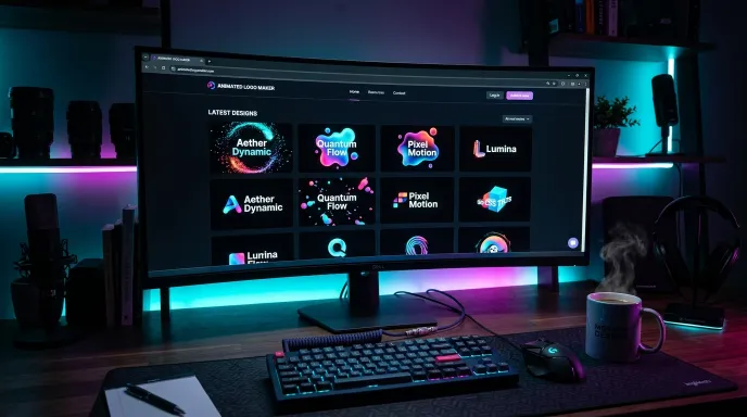
- GIF: Widely supported for social media, email, and simple embeds. Fixed frame rate and file size.
- Live code (CSS/HTML): The best option for your own website, since the animation stays smooth, scalable, and doesn’t rely on a fixed-size image file. A tool that offers a ready-to-paste code snippet alongside standard exports, like the animated logo maker, saves you from needing a separate development step to get this working live.
- PNG (static): Useful as a fallback image or for contexts that don’t support animation at all, favicons, some email clients, printed materials.
Exporting a GIF when you actually needed a live, scalable animation on your website (or vice versa) is one of the most common avoidable mistakes in this whole process.
Common Mistakes When Making an Animated Logo
- Choosing the boldest animation without considering repeated exposure. An animation that’s fun once can become genuinely annoying after the fiftieth time a visitor sees it in your header.
- Ignoring load time and file size. A heavy GIF or video file can slow down a website page, a lighter animation format (like live CSS) avoids this problem entirely.
- Skipping the transparent background option. Without it, your animated logo shows up with a visible colored box behind it, which looks out of place against most website backgrounds.
- Not testing at the actual size it’ll be used. Many animation details that read clearly at a large preview size get lost or look cluttered at a small header or icon size.
- Treating the first generated result as final. Comparing a few different categories, styles, and animation types tends to reveal a noticeably stronger option than the very first batch.
Keeping Your Animated Logo Consistent With Your Static Brand
An animated logo shouldn’t feel like a completely separate identity from your static logo, business cards, letterhead, and anywhere else motion isn’t practical. Keep the underlying colors, wordmark style, and icon consistent between both versions, the animation should feel like your existing logo brought to life, not a different design entirely. If you’re building both at once, it helps to lock in your color palette and core icon or wordmark shape first, then treat animation style as a layer on top of that foundation rather than a separate creative decision made in isolation.
Frequently Asked Questions
How do I make an animated logo? Decide where it’ll be used first, choose an animation style that matches that context and your brand tone, generate and compare a few options, fine-tune the speed and intensity, then export in the format that actually fits where it’s going, GIF, live code, or a static PNG fallback.
What’s the best animation style for a website header logo? Subtle, continuous motion tends to work best for headers, since visitors see it repeatedly. Simple 2D effects like a gentle pulse or float usually outperform bold, attention-grabbing animations in this specific context.
Should I export my animated logo as a GIF or a video file? It depends on where it’s going. GIFs work broadly across social platforms and email. For your own website, a live code embed (CSS-based) tends to look smoother and load lighter than either a GIF or a video file, if that option is available.
Can I make an animated logo without any design or coding skills? Yes. Generator-based tools handle the animation logic and styling for you, you’re selecting from pre-built options and adjusting simple settings like color and speed, rather than hand-coding or animating anything from scratch.
Does an animated logo need to be 3D to look modern? No. Clean 2D animations, especially subtle pulse, float, or fade effects, often read as more professional and modern than an overly busy 3D or artistic effect, particularly for business and corporate contexts.
How long should a logo animation last before it loops? For continuous-use contexts like a website header, a shorter loop, roughly two to four seconds, tends to feel smoother and less repetitive than a longer cycle. For a one-time intro or splash screen, a slightly longer, more elaborate sequence is more acceptable since it only plays once.
Final Thoughts
Making an animated logo doesn’t require animation expertise, it requires matching the right style and intensity to where the logo will actually be seen, then exporting it in a format that fits that context. Get those two decisions right, and the rest is mostly comparing options until one feels right.
Ready to generate your own batch of animated logo options? Try the free animated logo maker, compare styles across categories and animation types, and export as a PNG, GIF, or live code snippet.
For more free naming and branding tools, explore the Business Naming & Branding Tools collection.
Written by Waseem Aijaz, WordPress Developer and SEO Specialist. Connect on LinkedIn.