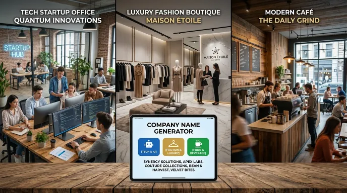

Quick answer: To turn a name into a logo, start by deciding on a tone (minimal, bold, elegant, playful), then choose a wordmark style that matches it, decide whether you need an icon or just the name itself, and settle on a simple color direction. From there, a text brief describing these choices gives a designer or an AI image tool enough to actually start working, far more useful than just handing over the name alone.
You’ve got a name. Now what? A lot of people get stuck right here, staring at a brand name with no clear sense of what the logo should actually look like. The good news is this step doesn’t require design skills to get right, it requires a process.
Why “Just Design Something” Doesn’t Work
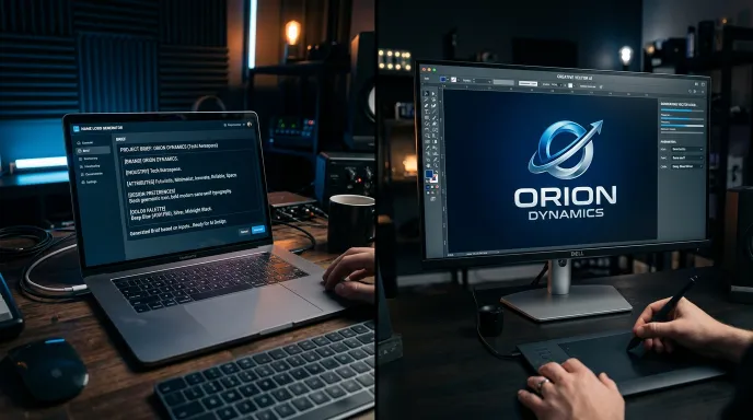
Handing a designer (or an AI image tool) nothing but your brand name usually produces generic, unfocused results. Without direction, there’s no way to know if you want something minimal or ornate, playful or serious, icon-based or text-only.
The fix isn’t learning design software, it’s getting clear on a handful of decisions before anyone starts sketching anything.
Step 1: Decide on a Tone
Before anything visual, get clear on the feeling your brand should communicate. A few common directions:
- Minimal and confident. Clean lines, lots of white space, understated.
- Bold and energetic. Strong shapes, high contrast, attention-grabbing.
- Elegant and premium. Fine details, refined typography, restrained color.
- Playful and approachable. Rounded shapes, warmer colors, a bit of personality.
This single decision does more to shape your logo direction than almost anything else, and it’s something you can answer without any design background at all.
Step 2: Choose a Wordmark Style
A wordmark is your brand name styled as the core of the logo, and it’s worth deciding on its shape before worrying about icons or symbols.
| Wordmark Style | Feel | Works Well For |
|---|---|---|
| Clean sans-serif, single weight | Modern, neutral | Tech, SaaS, general business |
| High-contrast serif | Elegant, established | Luxury, editorial, legal |
| Rounded, soft letterforms | Friendly, approachable | Kids’ brands, casual food, wellness |
| Condensed technical sans | Precise, engineered | Software, engineering, finance |
| Hand-finished or slightly irregular serif | Warm, organic | Craft goods, natural products, artisan brands |
Matching your wordmark style to your Step 1 tone narrows things down fast, an elegant tone almost never pairs well with a bouncy, playful wordmark, and vice versa.
Step 3: Decide If You Need an Icon at All
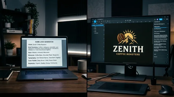
Not every logo needs a separate icon or symbol. Plenty of strong brand identities rely entirely on the wordmark itself, letting spacing, weight, and typography carry the whole identity.
An icon makes sense when:
- You need something recognizable at a very small size (a favicon or app icon, for example).
- Your brand has a clear, ownable visual metaphor (a leaf for a wellness brand, an orbit line for a tech brand).
- You want a mark that can work independently of the full name in some contexts.
If none of those apply strongly, it’s completely fine to skip the icon and lean on a well-designed wordmark alone.
Step 4: Pick a Simple Color Direction
You don’t need a full brand color system yet, just a starting palette of two or three colors that match your tone. Dark, high-contrast palettes tend to read as bold or premium. Soft, muted tones read as calm or organic. Bright, saturated colors read as playful or energetic.
Step 5: Write (or Generate) a Logo Brief
Once you’ve made these decisions, put them into a short written brief, a few sentences describing the wordmark style, whether there’s an icon and what it represents, and the color direction. This is exactly the kind of brief a designer needs to start meaningful work, and it’s also usable as a prompt if you’re exploring options with an AI image tool.
If you’d rather skip straight to a starting brief instead of building one from scratch, a brand name to logo generator can produce exactly this, a text description of a wordmark and icon direction, built around your actual brand name, industry, and a chosen style tone. It won’t hand you a finished logo file, but it gives you a genuine starting point instead of a blank page.
From Brief to Finished Logo
Once you have a clear brief, you’ve got a few paths forward:
- Hire a designer and hand them the brief directly, this tends to produce much better results (and faster turnaround) than a vague “make me a logo” request.
- Use a logo maker tool that lets you build a wordmark and icon combination yourself from templates, using your brief as a guide for which templates to explore first.
- Use an AI image tool with your brief as the prompt, useful for quick visual exploration, though results usually need refinement or a designer’s polish before they’re ready for real use.
None of these paths require you to already know how to design, they just require you to walk in with direction instead of a blank request.
What a Good Logo Brief Actually Looks Like
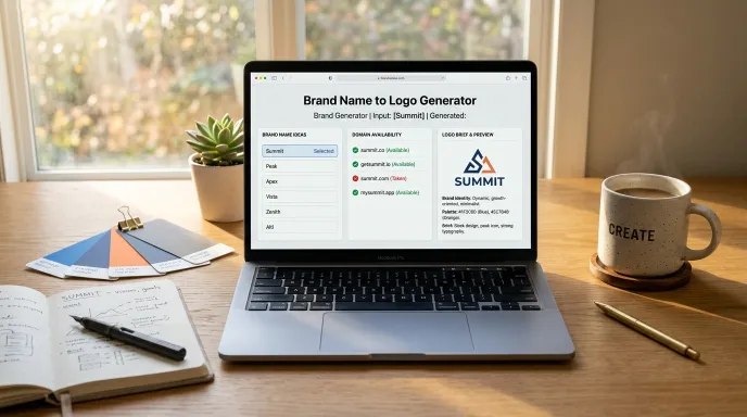
It helps to see the difference between a vague request and a usable brief. “Make me a logo for my coffee brand” gives almost nothing to work with, every designer or AI tool will interpret it differently. Compare that to something like: “A warm, hand-finished serif wordmark, paired with a simple leaf icon, using an earthy color palette.” That second version answers the tone question, the wordmark question, the icon question, and the color question, all in one sentence. It’s specific enough that two different designers working from it would likely land somewhere in the same general direction, rather than producing two completely unrelated results.
Common Mistakes When Turning a Name Into a Logo
- Skipping the tone decision entirely. Jumping straight to colors or fonts without deciding on an overall feeling usually produces a logo that doesn’t hold together.
- Trying to include too much in one icon. A strong icon usually represents one clear idea, not three or four combined into a cluttered symbol.
- Choosing a wordmark style that fights the name itself. A short, punchy name in an overly ornate script can feel mismatched, keep the wordmark style consistent with the name’s own personality.
- Not testing the logo small. A design that looks great large can fall apart as a tiny favicon or app icon, always check how it holds up at a small size.
- Treating the first direction as final. Comparing two or three different tone/style combinations before committing usually produces a stronger result than locking in the very first idea.
Frequently Asked Questions
How do I turn a name into a logo? Decide on a tone first, minimal, bold, elegant, or playful, then choose a matching wordmark style, decide if you need an icon, and settle on a simple color direction. Putting these decisions into a short written brief gives a designer or AI tool enough direction to actually produce something usable.
How can I create a brand name logo? Start with the same process: tone, wordmark style, icon decision, and color direction. A generator that produces a logo brief based on your brand name and industry can speed up this first step significantly.
Is $500 too much for a logo design? It depends on scope and experience level. A simple wordmark-only logo from a freelance designer might cost less, while a full brand identity package (logo, color system, typography guide) from an established designer can reasonably cost more. Walking in with a clear brief, rather than an open-ended request, tends to reduce both cost and revision rounds regardless of budget.
Can I design a logo myself without hiring anyone? Yes, especially if you start from a clear brief rather than a blank page. Many people use logo maker tools with template-based wordmarks and icons, guided by the same tone, style, and color decisions covered above.
Does my logo need an icon, or is a wordmark enough? A wordmark alone is often enough, especially for service-based or professional brands. An icon becomes more useful when you need strong recognition at small sizes or have a clear visual concept tied to your brand.
Final Thoughts
Turning a name into a logo doesn’t require design training, it requires a handful of clear decisions made in the right order: tone, wordmark style, icon (or not), and color direction. Once you’ve made those calls, you’ve got a real brief instead of a blank page, whether you’re handing it to a designer or exploring it yourself.
Want a head start on that brief? Try the free brand name to logo generator, enter your brand name and industry, and get a name, domain, and logo direction brief together in seconds.
For more free naming and branding tools, explore the Business Naming & Branding Tools collection, or jump straight to the brand name to logo generator to get started.
Written by Waseem Aijaz, WordPress Developer and SEO Specialist. Connect on LinkedIn.